ARTICLE AD
Introduction to Power Apps component framework
100 XP
5 minutesMicrosoft Power Apps component framework enables you to create reusable code components that you can use within your Power Apps applications and Power Pages websites. The component framework empowers developers to build code components when the out-of-the-box components don't fit an app maker's needs. Code components are visual controls that help you create a custom user experience. These components can also include business logic that complements the visualization to enforce rules unique to the scenario you're implementing.
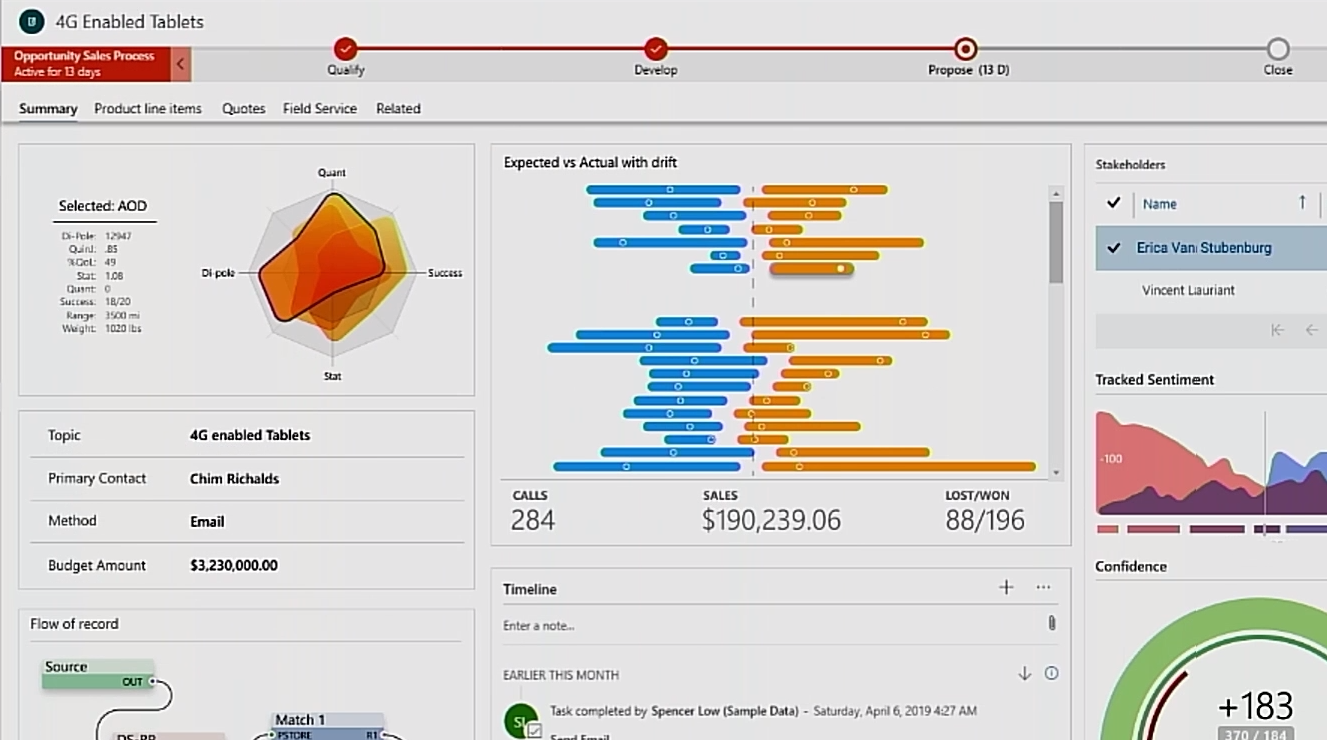
For example, an existing app detail form might resemble the following image.
However, if you reconfigured your app to use custom code components, your app might look something like the following image.
Before the Power Apps component framework existed, you would have used HTML web resources to provide any custom presentation to an app's form. Now, you can use a more modernized framework that allows you to expose capabilities to your app that would otherwise be impossible to access or, even worse, be unsupported by Microsoft.
Power Apps component framework advantages
Power Apps components are built on top of a robust framework that supports modern web practices. As a result, a few of the advantages are:
Access to a rich set of framework APIs that expose capabilities like component lifecycle management, contextual data, and metadata.
Support of client frameworks such as React and AngularJS.
Seamless server access through Web API, utility and data formatting methods, and device features like camera, location, and microphone.
Optimization for performance.
Reusability.
Use of responsive web design principles to provide an optimal viewing and interaction experience for any screen size, device, or orientation.
Ability to bundle all files into a single solution file with other app resources.
Types of components that you can create
Field - A custom control for a field on a form. For example, you could use a custom code component to render a slider instead of a simple text box to input a number. The slider could have custom business logic that limited the stops on the slider based on other data available and bound to the component.
Dataset - A custom control to display rows of data. For example, you could build a daily scheduler code component instead of a common grid with rows and columns to display today's appointments. The code component could include features like drag and drop to reschedule appointments.
Creator Kit components
The Power Platform Creator Kit is a collection of several commonly used Power Apps component framework controls. Additionally, the kit includes a set of templates and other utilities to help improve developer productivity. All of the components included use the Fluent UI framework to provide consistency. These components can be ready to use or provide inspiration for code components you might build. You can find all the source code for the components on GitHub.
Community components
The Power Apps community has been active in building open-source code components and sharing them with others. For example, validating user input against a regular expression is a common requirement. You could write client script to perform this validation or even write and use your own Power Apps code component. But it might be beneficial for you to check if someone else has already solved this problem for you. Numerous samples can be found at PCF Gallery.
Where to find help
If you encounter areas where you need assistance, the best place to start is the Power Apps component framework, ALM & Pro Dev community forum. There, you can find a wealth of questions and answers on a wide variety of topics, and you can submit your own questions as well.
Power Apps component framework architecture
100 XP
10 minutesYou can implement code components using HTML, CSS, and TypeScript. While you aren't required to use any particular UI Framework, React and Fluent UI are popular choices.
Component composition
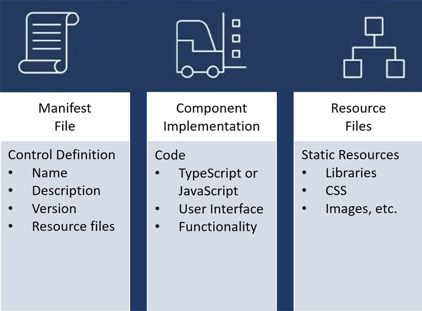
The following image shows the three key areas of a Power Apps component: a manifest input file, its implementation, and any other resource files that the component might need.
A manifest is used to identify any properties that are available for use by the application hosting the component. When app makers use the code component, they can statically set a value for the properties. Or they can dynamically bind it to one of the available data columns in the application. Properties allow the application and the component to communicate about data without the app having to understand the implementation of the component.
When you create a component, your code needs to implement an interface that provides a consistent way for the hosting app to interact with your component. Your code component accomplishes this by implementing the StandardControl interface.
export class FirstControl implements ComponentFramework.StandardControl<IInputs, IOutputs> {}
Power Apps component life cycle
When you develop a component, you implement all or some of the StandardControl interface methods in the following table depending on your component requirements. These methods allow the hosting runtime to manage the life cycle of the code component.
| init | Required. Use this method to initialize the component instance. Components can kick off remote server calls and other initialization actions in this method. You can't initialize dataset values with this method; you must use the updateView method. |
| updateView | Required. This method is called when any value in the component’s property bag has changed. If you started any load data requests in the init method that might not be finished, your code must handle this state and provide a visual loading indicator. |
| getOutputs | Optional. Called by the framework before the receipt of new data. Use this method when dynamically managing bound properties in a control. |
| destroy | Required. Invoked when the component is to be removed from the DOM tree. Use the destroy method for cleanup and release any memory the component uses. For example, if you're using React, use ReactDOM.unmountComponentAtNode inside the destroy method. This prevents any performance issues caused by code components being loaded and unloaded within a given browser session. |
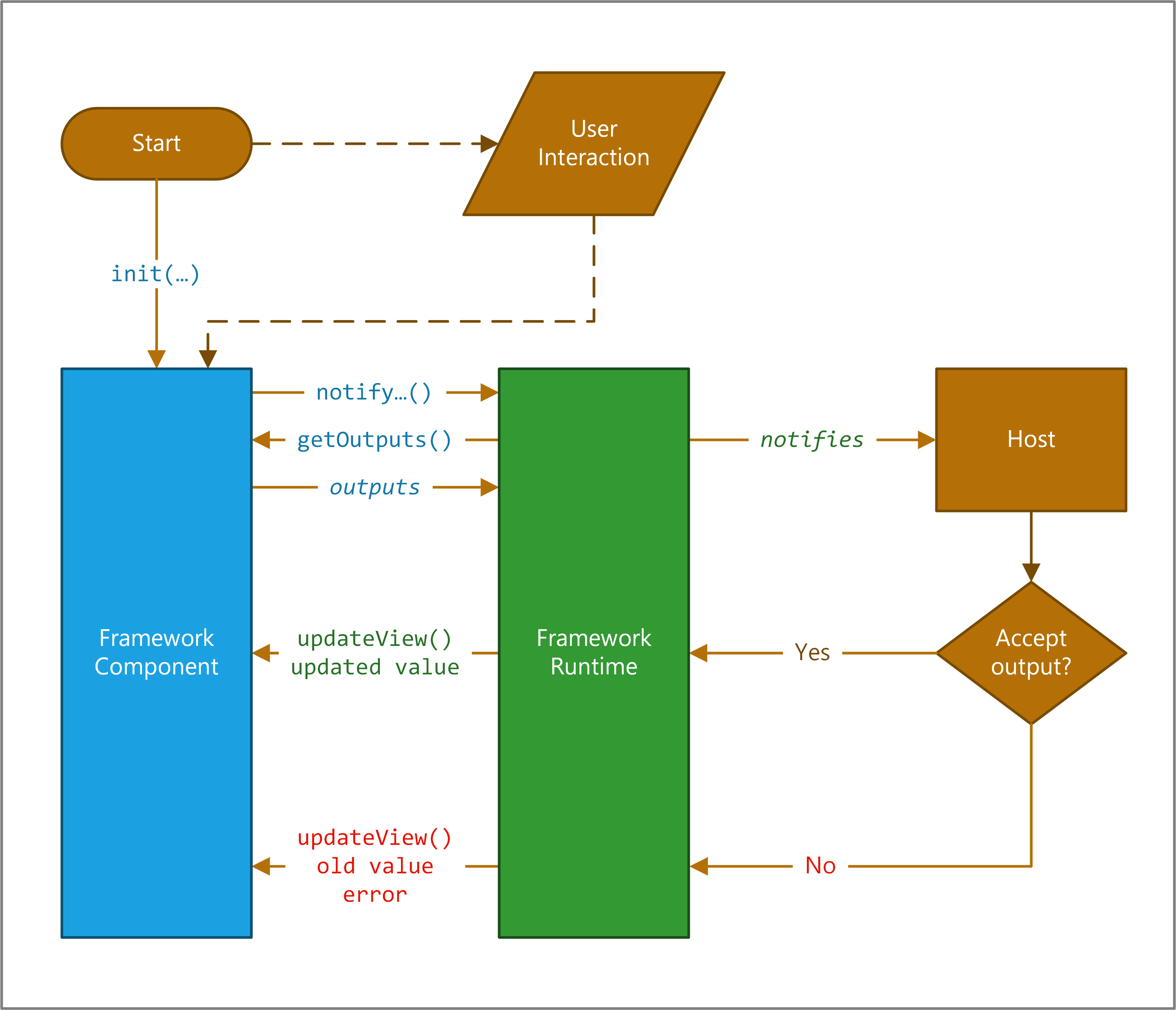
These methods are invoked through a framework runtime process in a standardized life cycle, as shown in the following illustration.
At the top of the image, the framework calls your component's init() function. If your component is interactive, you also need to notify the host that the component's output has changed by calling the notifyOutputChanged method.
The framework runtime then calls the getOutputs method to get values for all bound properties of your component.
The runtime then notifies the host, which validates the output. If the output is valid, it calls the updateView method on your component. If it isn't valid for whatever reason (for example, a business rule found the new output invalid), it calls your updateView method and passes the old value along with an error message. In either scenario, your component can update the user interface and display an error message if appropriate.
Next unit: Power Apps component tooling
Power Apps component tooling
100 XP
10 minutesWhen you build a Power Apps code component, you use a combination of tools to streamline the steps required from start to finish.
| Create | Create and initialize the component project using a template. | Power Platform Command Line Interface (CLI) |
| Implement | Describe and implement your component behavior and styling. | Code editor or Integrated Development Environment (IDE) of your choice |
| Build | Validate and transpile TypeScript code, customize a component manifest. | Power Platform CLI or Visual Studio Code |
| Debug | Validate and troubleshoot component behavior without deploying it to a Dataverse environment. | Power Platform CLI |
| Package | Create a Dataverse solution file and package the component as part of that solution. | Power Platform CLI and Visual Studio msbuild |
Let's take a look at some of the tools that we use.
Power Platform CLI
The Power Platform CLI (command-line interface) is a developer-focused command-line tooling that provides commands for building custom code. This currently includes code components and plug-ins. The tool also has environment admin commands available for managing environments. You can also use the solution and package commands to implement application lifecycle management with solutions.
The CLI only takes a few steps to install. You can ensure you have the latest version by using the following update command:
pac install latest
When you start to build your code component, you use the CLI to scaffold your initial files using a template. The following command is an example of initializing a component using the field template:
pac pcf init --namespace Contoso --name Slider --template field
One of the prerequisites of installing the CLI is to install node package manager (npm), which you use to manage dependencies and build your code component. When you use the init command, it creates a package.json file configured with the dependencies for your code component and several commands like build that you use during the development of your component. The first npm command you run after initializing the component is install. This command downloads all the libraries needed to support the Power Apps component framework.
npm install
You can also request that when the initialization runs, it also runs the npm install by adding --run-npm-install to your init command options.
pac pcf init --namespace Contoso --name Slider --template field --run-npm-install
As you develop your code component, you can check for any code issues using the following build command:
npm run build
This command validates your manifest, run the TypeScript transpiler, and let you know of any problems.
A test harness is also available so you can test your code component locally without having to deploy it to an environment. You can launch the test harness with your code component using the following start command:
npm start
You can also enable watch mode by using npm start watch command. If you make changes to your code in watch mode, the test harness automatically picks them up without restarting.
To speed up your testing of code components, the CLI can authenticate to your development environment and push your code component for testing in real apps. The following command would build and push the latest version of your code component to your currently configured Dataverse development environment.
pac pcf push --publisher-prefix dev
Tools for Visual Studio Code
The Power Platform extension for Visual Studio Code brings the Power Platform command line interface (CLI) to work within the context of the editor environment. You can install the extension from the Visual Studio Marketplace. Once installed you can use the CLI pac command from the terminal window.
Tools for Visual Studio
You install these tools either using the standalone install or as part of installing Visual Studio. You can find them at Download Visual Studio 2022 for Windows & Mac.
The msbuild command is used when you package your component as part of a Power Apps solution for deployment into a Dataverse environment. For example, the following commands initialize a new solution for your component and create a msbuild project file that manages creation of the output solution files during a build.
pac solution init --publisher-name Contoso --publisher-prefix contoso ‑‑outputDirectory vssolution
To have your code component packaged in the solution, you must add a reference to your component. This ensures that when a build is run your component is included in the output solution that is generated. The following command adds the reference:
pac solution add-reference --path \<path to your Power Apps component framework project\>
You can use the msbuild command to generate the solution files with the solution references configured. The following command runs the build the first time:
msbuild /t:build /restore
Tip
If you are getting an error that msbuild command is not recognized, try running the command from the Developer Command Prompt for Visual Studio. This shortcut is created as part of a Visual Studio or Tools for Visual Studio installation.
After the first build, you can run the msbuild command to regenerate the solution files. The generated solution files are located in the \bin\debug\ (or \bin\release) folder after the build is successful. Once the output zip file is ready, you can either manually import the solution into Dataverse or automatically deploy it using the Microsoft Power Platform Build Tools.
Choose an IDE
We recommend using Visual Studio Code or Visual Studio to write your components. But you can use any IDE you choose to build custom Power Apps code components.
Next unit: Component manifest
Component manifest
Configuring the component manifest is an essential step in building a code component. The ControlManifest.Input.xml file is initialized with some of your choices, like name and type of component, when you use the pac pcf init command. You must still customize the file to specify any properties and resources you're using and to enable any of the framework's features that you use in the component.
Component properties
Properties define a contract between the code component and the hosting application. They should abstract the maker from how you implement the component but still provide configurable capabilities for the maker using the component. The following are some of the common types of properties you might need to add properties to a component:
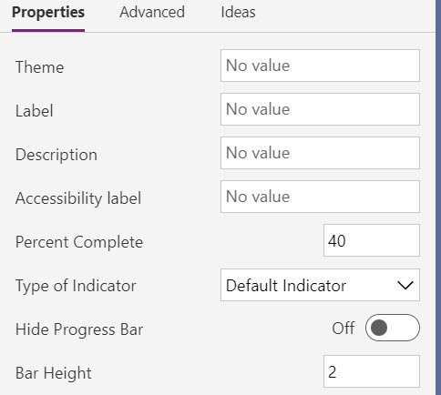
Allow business data to pass into and from the code component. For example, by passing a geolocation into the component, the component could show a map highlighting a specific location.Allow controlling component features and behaviors. For example, using our map example, a property could be added that indicates if the user can zoom in or out on the map.Allow some aspects of the component style to be customized. For example, on the map, the component might allow you to customize the pin color by providing a property the maker can configure.The following screenshot is an example manifest showing the properties defined for a progress indicator component.
When a maker configures a code component, the properties defined in the manifest are available for configuration. This image shows how the above manifest for a progress indicator component is shown to a maker in the application designer. It allows them to see the available properties and customize them.
Property attributes
There are a number of attributes on a property you can configure depending on your needs. The following are the more common ones you should consider:
of-type - This attribute defines the data type of the property. There are many types to choose from, like SingleLine.Text to Enum. Some types, like Enum offer a more rich configuration experience for the maker by providing a fixed list to select from. Others limit the data content based on the type that can pass from the hosting app. Some are more appropriate for data binding, like Lookup.Simple. Always try to avoid changing data types once you have published your component.
usage - This attribute identifies if the property is input, output or bound. This is for model-driven apps. The bound option expects to have a table data column associated to provide the data value.
required - Indicates if a value for the property is required. If adding new properties after a component is published, consider the impact of making the property required on existing apps that use the component.
default-value - This attribute has the default value provided to the component. In model-driven apps, this property is only allowed on properties with a usage type of input. Providing a default value can be helpful to makers to provide an idea of how you intend the property to be set. When you add a new property to an existing component, the default value is often set to the value the component used before it became configurable via the property.
As you evaluate the properties you plan to add, here are a few things to consider:
Avoid having too many properties on your component, requiring the maker to navigate a long list of options.Use names for properties that are clear. When possible, provide enough details in the description to inform the maker on its purpose.Consider adding some properties to allow makers to style your component. These properties can be important when you might use the component in a wide variety of applications.Avoid renaming or removing properties after you publish your component, as these will be a breaking change for existing consuming apps.Component resources
The resource node in the manifest identifies the resource files that the component requires. In a new component, this initially only contains the required code element. You can add other resources your component depends on. The most common are css and resx.
The css element allows you to identify a CSS (Cascade Style Sheet) file that should be loaded. You can optionally specify an order to load them in if you have multiple. The following code is an example of loading two CSS files.
The resx node in the manifest identifies the file used to manage the localized strings you define. If you're going to localize, it's easier to add this on a new component and update as you add properties. Properties in the manifest value of the display-name-key and description-key attributes are used to look up the localized value if it can be located in a loaded resx resource file.
For example, review the following property definition and how those attributes are defined.
In a resx file, which is an XML file that uses the Microsoft ResX Schema, you would define the following data elements for the property keys.
You would then create a separate resx file for each language you support.
Next, in your manifest resource node you would add the following resx nodes to load the files when the component is used.
Component feature usage
The framework's device, utility, and WebAPI features are available for use by components that you use in a model-driven app. To use one of these features, you must declare it in the manifest in the feature-usage node by adding a uses-feature node. The following code is an example of enabling the use of the WebAPI feature.
Next unit: Demo of the Power Apps code component
Demo of the Power Apps code component
In this video, we walk through creating a Power Apps code component.
Next unit: Check your knowledge
Check your knowledge
Answer the following questions to see what you've learned.
Which of the following options is NOT a template type for the controls built with the Power Apps component framework?
Field
Unbound
Unbound isn't a valid template type for the controls built with the Power Apps component framework.
Dataset
Which of the following files is used to define control properties for a Power App code component?
index.ts
Manifest File
Manifest File is used to define control properties for a Power App code component.
Resource File
CSS File
Which of the following methods can be used to notify the framework that the control has new outputs?
notifyOutputChanged
notifyOutputChanged method can be used by the control implementation to notify the framework that it has new outputs. This is passed to the control as a parameter of the init method.
init
updateView
getOutputs


 Bengali (Bangladesh) ·
  English (United States) ·