
ARTICLE AD
A quick and easy way to change the colors in your app is to apply a theme. In Power Apps, there are several out-of-the-box themes to choose from. The following screenshot illustrates all the themes that are available in your app.
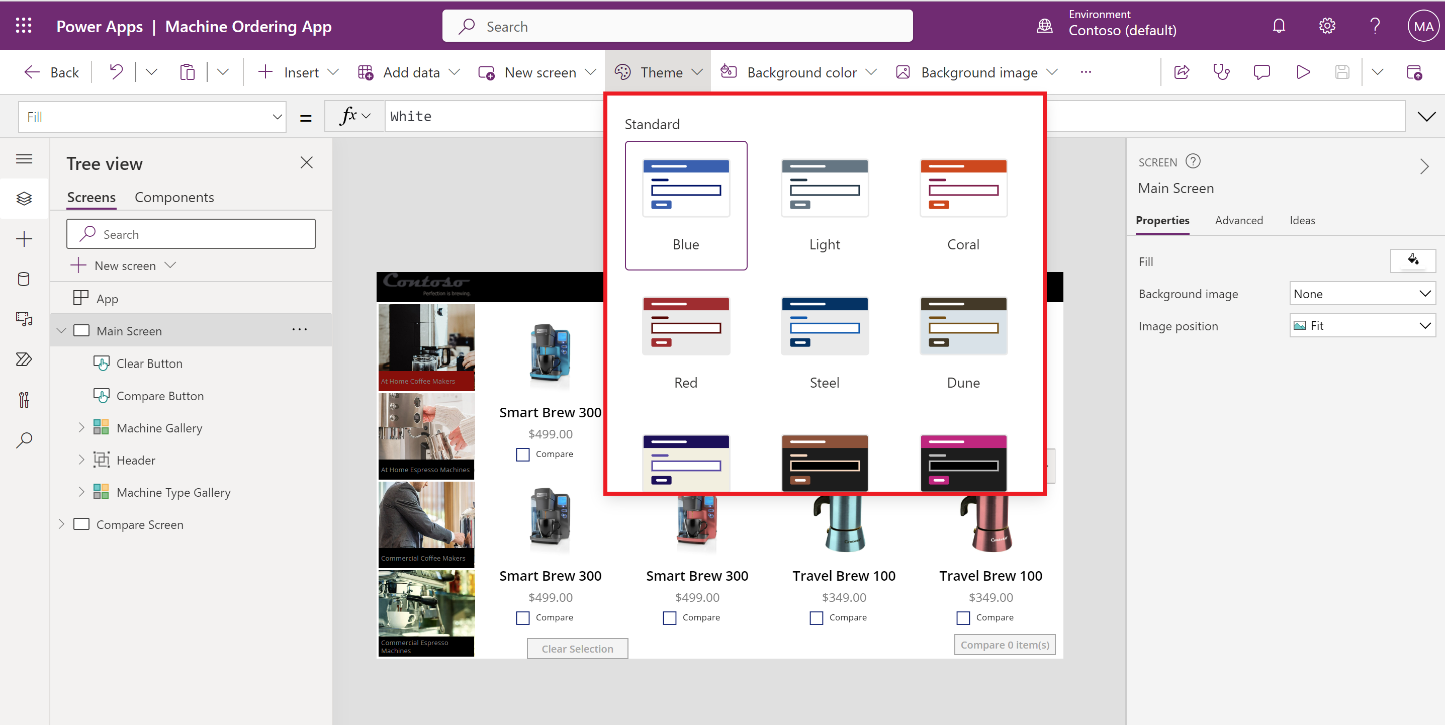
These themes have a specific set of default colors and visual elements, which alter the look and feel of your entire app. To use any of these themes in your Canvas app, select a theme from the ribbon. The changes to your app take effect immediately.
If none of the included themes work for your app, you can create a custom theme. For example, if you decide to select the Steel theme but want the screen background to be a lighter color, this can be easily done. To change the background of your screen, change the Fill property to RGBA(250, 250, 250, 1). The screen is a slighter lighter shade of gray. Keep in mind, this only changed the fill of that specific screen, if you want to add a new blank screen it would still have the Fill property of RGBA(232, 232, 232, 1). This is by design when working with a canvas app. Also, there's no option to create a Custom theme for a canvas app and store it to be used for other apps.
Many organizations select the theme that best suits their needs, and then alter the various control properties to align with their corporate branding.
Branding a control
100 XP
5 minutesAs noted earlier, one of the built-in themes may not match your organizations desired look and feel for the app. You can customize your app by changing various properties of the app controls. By adjusting a few of the Control properties, like Fill, Hover, and Border you can completely change how the control looks. If you decide to customize your controls, it's recommended that you do this through testing to ensure that you don't run into any complications when users interact with the app.
For example, consider the Button control. The following are some of the properties of a Button control that you could customize to better fit your company's theme.
Typical properties
These properties are in effect when the user is not interacting with the control.
BorderColor - The color of a control's border.
BorderStyle - Determines whether a control's border is solid, dashed, dotted, or none.
Color - The color of text in a control.
Fill - The background color of a control
Disabled properties
These properties are in effect when the control is disabled. A control can be disabled if the DisplayMode property is set to Disabled.
DisabledColor - The color of text in a control if its DisplayMode property is set to Disabled.
DisabledFill - The background color of a control if its DisplayMode property is set to Disabled.
Hover properties
These properties are in effect when the user hovers over the control with a mouse.
HoverColor - The color of the text in a control when the user keeps the mouse pointer on it.
HoverFill - The background color of a control when the user keeps the mouse pointer on it.
These are just some of the properties that you could modify. For more details about the properties that you can customize, see Color and Border Properties in Power Apps.
Note that each control is independent. This means that if you alter the HoverColor property of one button control on your screen or in your app, the other buttons in the app will remain unchanged. You must edit the properties of each control that you want to appear in a different manner.
Some color settings are only controlled by the theme
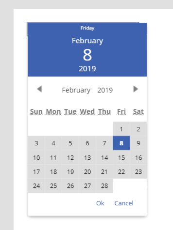
There are certain aspects of controls that cannot be altered and are specific to the theme that you select. For example, here's an example of the Date picker control.
In Power Apps Studio, add the Date picker control.
Put the app in preview mode and select the control so that it opens.
The color at the top of the Date picker control is specific to the theme, meaning there isn't a control property you can change to set the color manually. To change the color of that background you would have to select a different theme.
As you design your app, be sure to incorporate the use of icons. In the next section, you'll learn how to add an icon to a Canvas app to change the look and feel of the app.
Icons
100 XP
3 minutesWhen designing your app, utilize Shapes and Icon controls when possible to enhance the user experience of your app. There are certain shapes and icons that are universally recognized that you find in many of the apps that you use daily. For example, instead of adding a Button control to your app and setting the OnSelect property to Back(), you could as easily use the Back icon control and set its OnSelect property to Back().
Remember, icons are controls, and each control has a specific set of properties that can be modified to change how the control looks and functions. To view all of the available icon controls, select Insert and then expand Icons section.
These controls include arrows, geometric shapes, actions, and symbols. By incorporating shapes and icons, you can save space and reduce clutter in your app, especially when working with a Phone form factor app. The Phone form factor app has a smaller area for designing and adding controls so replacing some buttons with shapes and icons could really benefit the overall spacing of your app.
Images
100 XP
5 minutesThe Image control is a control that shows an image. The image may be from a local file or a data source. Adding an image, such as a company logo is an easy way to enhance the overall look and feel of your app. On each screen you can apply a Background image, and multiple Image controls. You're not limited to some images that you can display; you can have as many images as you would like. Too many images may cause issues with the app performance and load times, but you would have to add quite a few large images for this to be an issue. There's a set of properties specific to the Image control that allow you to customize how the image is displayed. When working with the Image control, a few of the more common properties you'll most likely want to modify are the Image, Image position, and Transparency properties.
Image - The name of the image that appears in an image, audio, or microphone control.
Image Position - The position (Fill, Fit, Stretch, Tile, or Center) of the image in a screen or a control if it isn't the same size as the image.
Transparency - The degree to which the controls behind an image remain visible.
Here’s a quick example of how to change the transparency and image position of an Image control.
In Power Apps, create a Tablet app using the "Product Showcase" App template.
On the left, under Screens, expand Group6 and select Image1.
In the right pane, set the Transparency property to 0.5.
You will notice that the image immediately becomes lighter in color.
In the Image position property, change this to Center.
The image appears to be zoomed in or larger.
As you develop your app, keep these settings in mind when using the Image control to enhance the look and feel of your app.
Personalization
100 XP
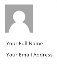
10 minutesIn Power Apps, you can show information about the current user with the User() function. This includes the full name, email address, and the picture that's associated with the user who's signed into a canvas app. It matches the "Account" information that is displayed in the Power Apps players and studio, which can be found outside of any authored apps. This may not match the current user's information in Office 365 or other services.
The User function returns a record of information about the current user:
| User().Email | Email address of the current user. |
| User().FullName | Full name of the current user, including first and last name. |
| User().Image | Image of the current user. This is an image URL of the form "blob:identifier". |
Set the Image property of the Image control to this value to display the image in the app. Here’s an example of how to add a user's profile picture, email, and name to your app.
On the ribbon, select + Insert, expand Media, and then select Image.
Set the Image property to this formula: User().Image
On the ribbon, select + Insert, and then under Popular section select Text label:
Set the Text property to this formula: User().FullName
Move the label so it's below the image control.
Add another label, and set its Text property to this formula: User().Email
Move the label so it's below the first label:
Using the tablet or phone form factors
100 XP
6 minutesIt's important to design your app for the primary device that it will be used on. There are two form factors to choose from, the Phone form factor and the Tablet form factor. The main difference between these is the Screen size. The screen size affects the amount of space available to build the app.
The Phone form factor has a smaller area to build your app, but if most of your users are accessing the app from a mobile phone then this is the best form factor for you. When building for mobile, select controls that will be easy to use on a mobile device, ensure that the text is large enough to be easily seen, and design the app in a single column vertical format.
The Tablet form factor has a larger area for designing your app and is the best option if your users are accessing the app from a tablet or PC. Because you have more screen size to work with, you have more flexibility in designing this app. Regardless of the form factor that you choose; the functionality available in the Power Apps Studio will be the same.
Take a moment and create two blank Canvas apps. For one of the apps uses the Phone form factor and for the other app use the Tablet form factor. You'll immediately notice the difference in the amount of space available on the screen to design your app.
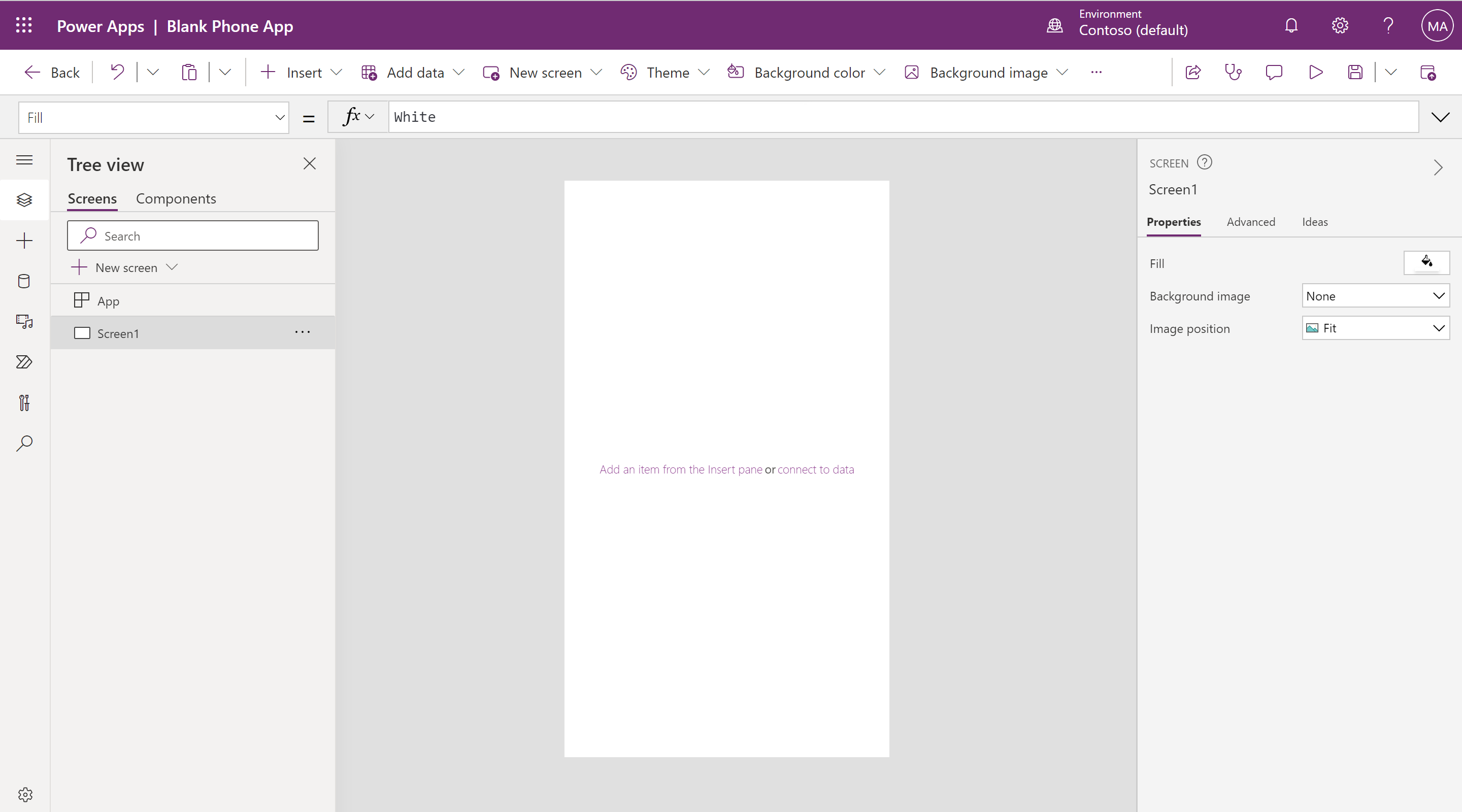
Phone form factor
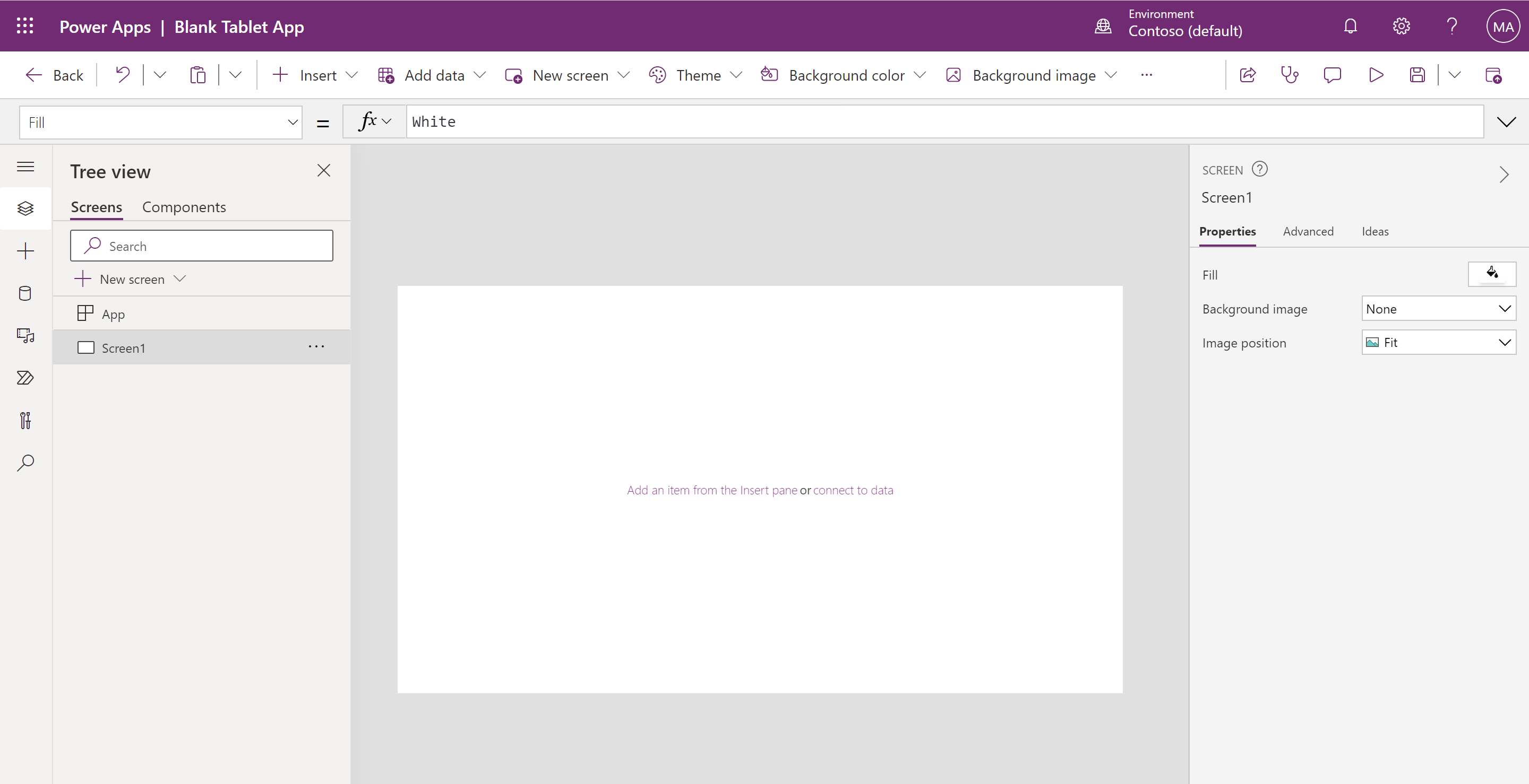
Tablet form factor
Depending on the form factor that you choose, you have the ability to alter the screen size. To view the current screen size and orientation, for either form factor, see following steps.
In Power Apps Studio, on the ribbon select Settings and then select Display.When you are in the tablet app, you notice multiple options to select from for the screen size. Be sure to select the appropriate size for most your app users.
16:9 (Default)
3:2 (Surface Pro 3)
16:10 (Widescreen)
4:3 (iPad)
Custom
The Phone form factor doesn't include screen size options.
Lock aspect ratio and lock orientation
Other options that you might want to consider regarding the screen size and orientation include the lock aspect ratio and lock orientation settings.
If you lock the aspect ratio, the app retains the appropriate aspect ratio for a phone. If the app is running on another kind of device, the app displays incorrectly and may show unwanted results. If you unlock the aspect ratio, the app adjusts to the aspect ratio of the device on which it's running.
If you lock the app's orientation, the app retains the orientation that you specify. If the app is running on a device for which the screen is in a different orientation, the app displays incorrectly and may show unwanted results. If you unlock the app's orientation, it adjusts to the screen orientation of the device on which it's running.
You can also modify the app's orientation by enabling Optimize embedding experience in Settings. This feature aligns the app when it's embedded and changes the background color of the hosting canvas to white.
Exercise - Create UI for a new canvas app
100 XP
10 minutesIn this unit, you generate a new canvas app that you customize with various pieces of the UI covered in the previous units. This should give you a good idea of the capabilities of UI design in Power Apps.
Note
Power Apps requires either an Office 365 license or a free trial. Learn more about your licensing options. Microsoft products include Microsoft Power Apps and Power Automate.
Creating a new blank app header
Log into Power Apps.
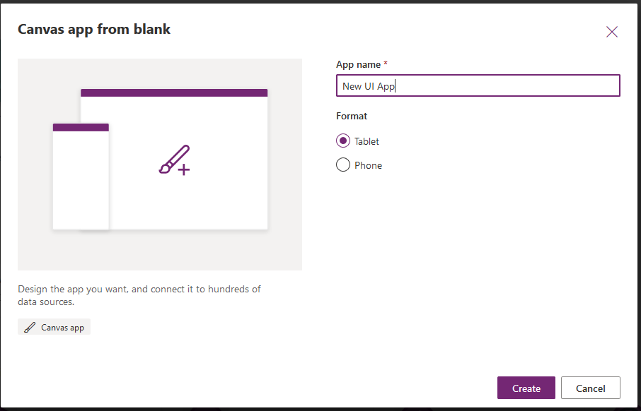
On the Home screen select Blank app, then under Blank canvas app select Create.
Name your app New UI App and select Create.
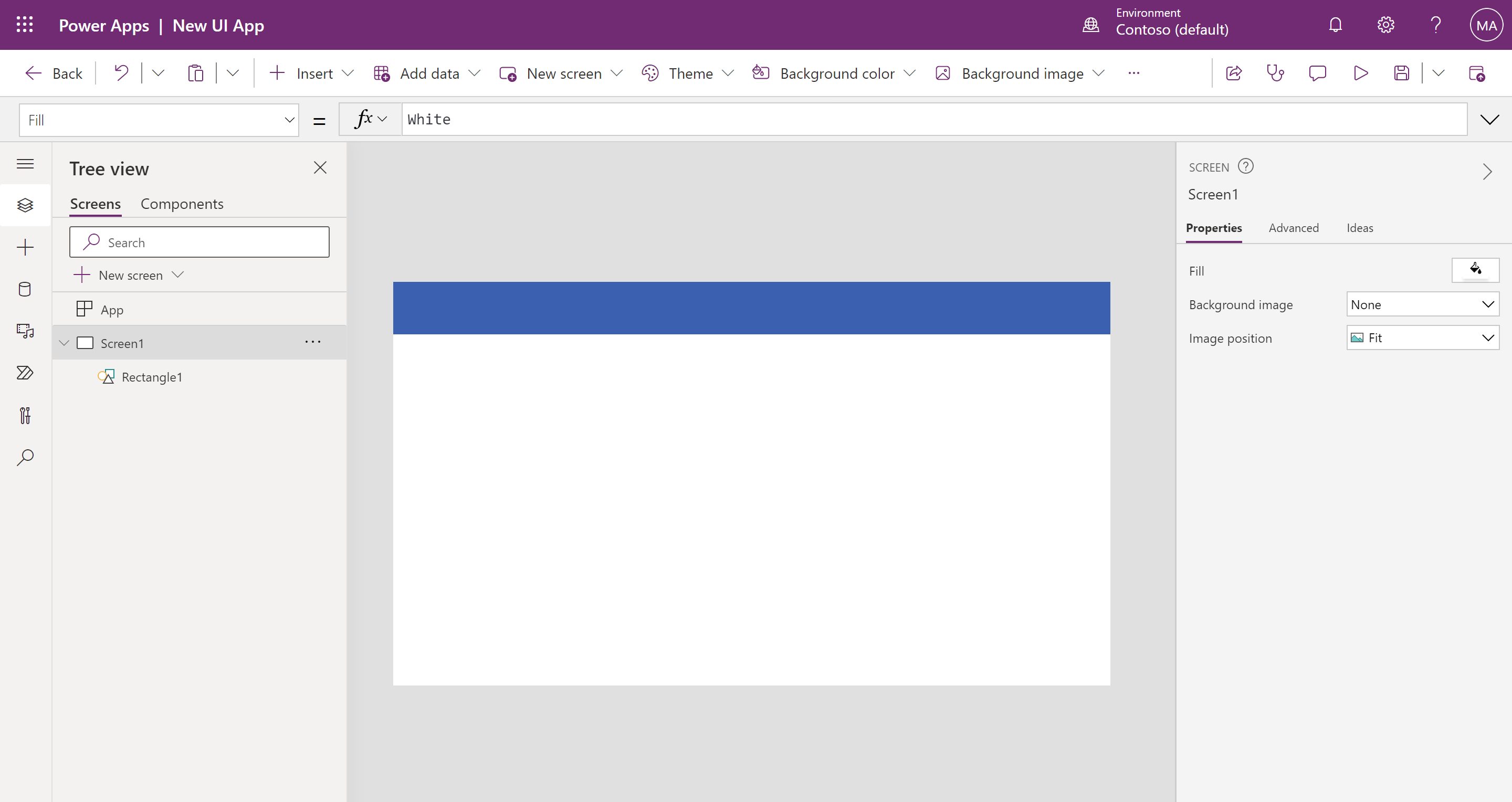
On the ribbon, select + Insert and then expand Shapes. Scroll down through the shapes and choose Rectangle.
Move and resize the rectangle to cover the top of your app screen.
On the ribbon, select + Insert, expand Media and then select Image.
Move the image to the top right corner of your app screen.
Change the Image property to:
PowerApps FormulaCopy
User().Image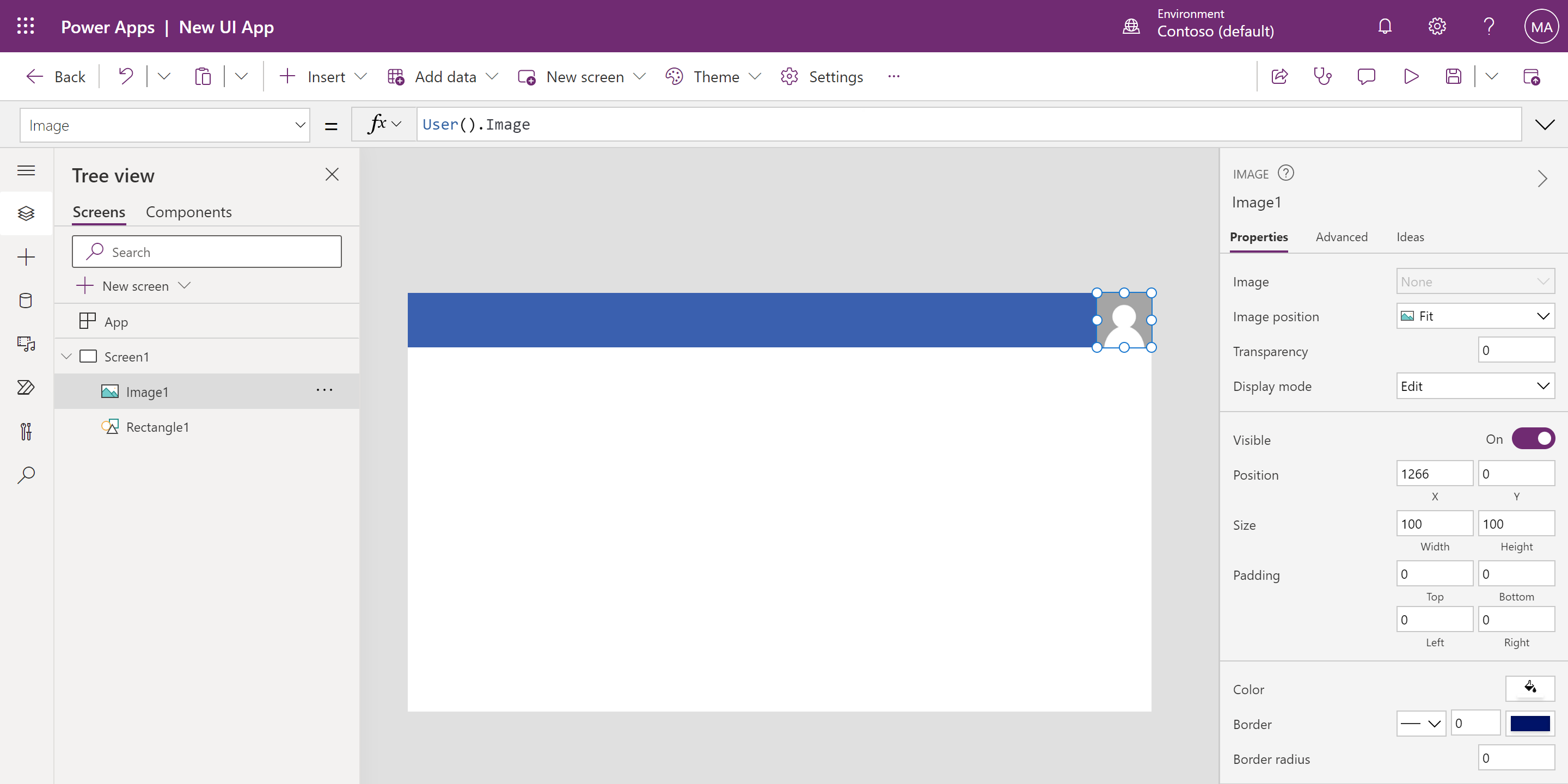
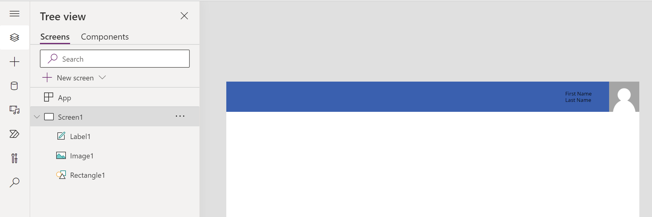
Insert a Label and change the Text property to:
PowerApps FormulaCopy
User().FullNameMove the label next to the image and resize as needed.
Insert a Button and move it to the middle of the screen.
On the ribbon, select Theme and then choose Forest.
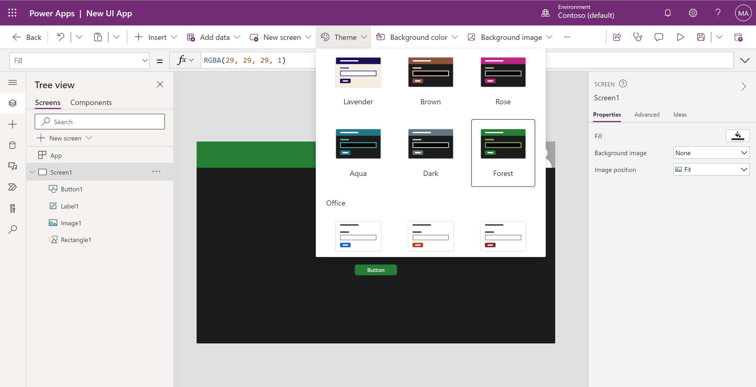
Notice how the entire app's color scheme changes according to the new theme, including the button, label, and font colors. This is how easily you can make your Power Apps look and feel unique and fun, but also enhance the usability and appearance.
Check your knowledge
200 XP
6 minutesHow to build the UI in a canvas app in Power Apps knowledge check
1.
When creating an app, what two form factors can you choose from?
Tablet and PC
Tablet and Phone
Tablet and Phone are the two form factors available.
Phone and PC
Tablet and iPhone
2.
Which formula returns the full name of the current Power Apps user?
User.FullName
FullName.User()
User().FullName
The formula that returns the full name of the current user is User().FullName.
User().Name
3.
When using an Image Control, which of the following ImagePositions does NOT belong?
Stretch
Fit
Tile
Expand
Expand is the ImagePosition that does not belong.


 Bengali (Bangladesh) ·
  English (United States) ·